Partner Article
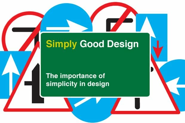
Simply Good Design
Keep the design simple and the message clear.
Whether somebody is browsing a website, reading a flyer or glancing at a poster there are only a few vital second to engage them and convey the message. Whilst there may be lots of things to say about a business or service it is important to be concise with the message and clear with the delivery.
Any fool can make things complicated, but it requires a genius to make things simple. - E.F. Schumacher
Whilst we don’t claim to be geniuses, as designers it is our job to ensure a design achieves its full potential and captures the attention and imagination of the target audience.
Here are a few principles that designers use to make sure the right message comes across.
Less is indeed more.
It is surprising how often designers are given an A4 page of text to fit into a space half that size. Unless the content is for a book, it is important to cut down the word count to what really matters. Summarise the message into a couple of sentences.
Imagine an advert or poster as a road sign. A passing driver will only have a few seconds to take in the information and make a decision, sometimes only giving it a quick glance.
Think about what items of information need to be conveyed and use them in order of importance. Creating a hierarchy that hooks the audience and entices them to find out more.
We live in an increasingly visual world where brands are crying out for attention. This means it is important to stand out with as much impact over the competition as possible.
These images show how the use of design has changed over time. Unlike the old text-heavy style mac advertisements, the iconic Ipod adverts make good use of colour, powerful imagery and a simplistic message. This creates a design that is vibrant, memorable and gets noticed. Note how little technical information there is on this advert - the idea is to create desirability and excitement around the product before going into detail.
Embrace the space!
It is not necessary to fill a whole page with text or images. Making use of space on the page is a powerful tool to make the message stand out.
Check out the Apple website where the product and message take centre stage - an effective use of white space make both stand out and create huge impact on the screen.
Be Creative!
This is where investing in a good designer really pays off. Good choice of imagery, a creative use of type or even a clever combination of the both are just a few tricks in a designers arsenal that help make a design be noticed and enjoyed.
Adding a creative sparkle to a design (usually a subtle one) must engage, entertain, or even challenge the audience. This will help the message to be more memorable and to have more an impact your viewers.
To find out how JUMP can help you with your design needs call us on 0845 170 1001 or email us on info@wesayhowhigh.com. We’d love to hear from you.
This was posted in Bdaily's Members' News section by JUMP UP LTD .
Enjoy the read? Get Bdaily delivered.
Sign up to receive our daily bulletin, sent to your inbox, for free.
Our Partners


 Why being ‘work-ready’ matters more than ever
 The North's future doesn't end at Manchester
 Exit or legacy? Why every owner needs a plan
 Who speaks up for SMEs when giants get bigger?
 The true value of HR in an AI-driven working world
 What new business rates guidance means for pubs
 Business success starts with people investment
 It's time to confront the digital poverty crisis
 Why a business exit is no longer all or nothing
 Culture is the foundation for sustainable growth
 Business must help young people take root in work
 Purposeful procurement for long-term growth